










Discover Alecse
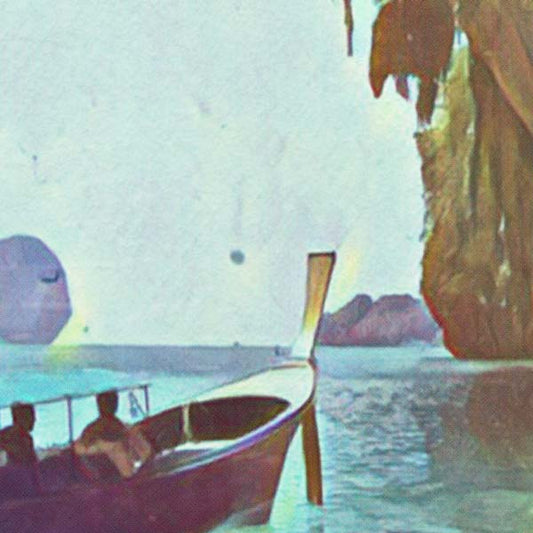
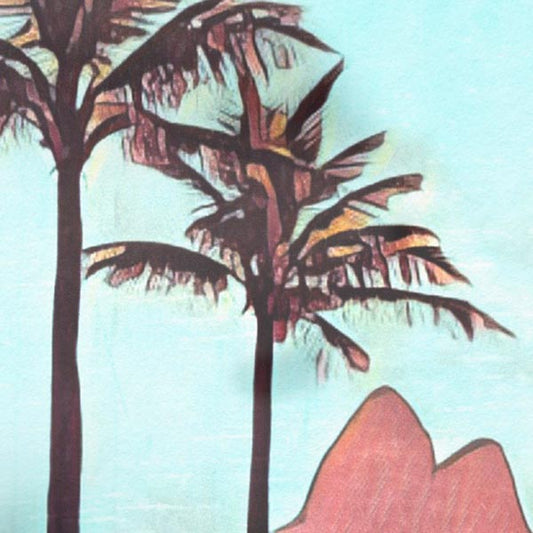
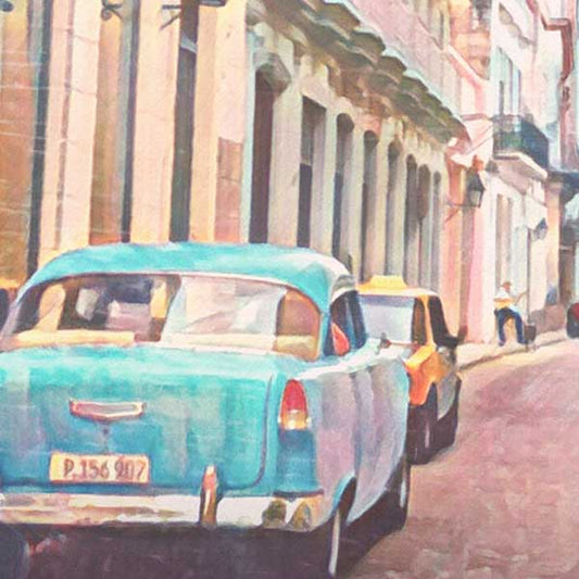
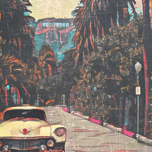
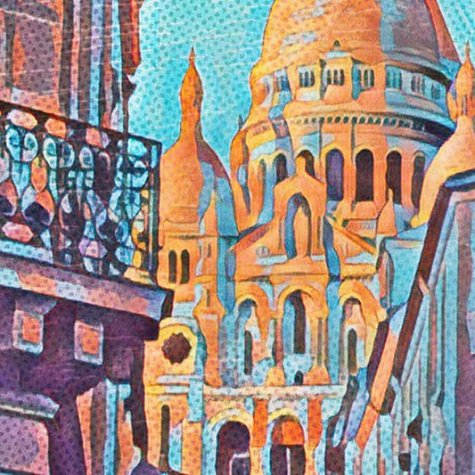
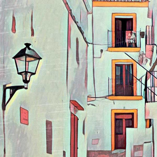
Explore the journey of Alecse, a poster artist blending photography, digital watercolor, and artistic blur. Discover his inspirations and unique vision.
¿Tienes una cuenta?
Inicia sesión para finalizar tus compras con mayor rapidez.

Sumérgete en el mundo de los viajes a través de nuestros pósters...

PÓSTERS DE VIAJE VINTAGE
Un mundo de carteles de viaje — hechos a mano por Alecse
Explore the journey of Alecse, a poster artist blending photography, digital watercolor, and artistic blur. Discover his inspirations and unique vision.

Alecse’s art challenges the ultra-HD trend with a nostalgic twist. His unique blend of blur and halftone brings timeless charm to modern poster design

Explore the journey of Alecse, a poster artist blending photography, digital watercolor, and artistic blur. Discover his inspirations and unique vision.

Browse Alecse’s most-loved creations, posters that have brought retro charm to homes across the globe. Start your collection today with these timeless pieces

THE RETRO CLUB
Enjoy 10% off your first order, exclusive member offers and early access to new collections. Plus, discover inspiring stories from The Poster Chronicles, delivered straight to your inbox.