


Palette & Posterity: Why Vintage Poster Art Endures
Some images seem to belong to a particular moment in history. Others have a remarkable ability to travel through time.
A poster designed decades ago can feel entirely at home in a contemporary apartment. Its colours may recall another era, its typography may have fallen out of fashion long ago, and yet the composition still has something immediate about it. We recognise its visual language, even when we cannot quite explain why it appeals to us.
That is one of the fascinating qualities of vintage poster art. Originally created to communicate, advertise and persuade, these images have gradually become part of our collective visual culture.
But what gives them their enduring appeal? And what can contemporary artists learn from the designers who helped shape this distinctive art form?
When Colour Becomes a Signature
Colour is often the first thing we notice in a vintage poster. Before we recognise the destination, read the lettering or identify the subject, we respond to the palette.
The warm reds, creams and golds associated with certain late nineteenth-century advertisements create a very different atmosphere from the geometric contrasts of Art Deco or the cheerful combinations found in mid-century travel illustrations.
These palettes are not simply decorative. They reflect the printing possibilities, aesthetic preferences and cultural influences of their time.
Early commercial lithography encouraged artists to think in clearly defined areas of colour. Rather than relying on subtle photographic gradations, designers often built their images from strong contrasts and carefully balanced shapes.
The result could be remarkably economical: a handful of colours, arranged with confidence, was enough to suggest an entire atmosphere.
That economy remains one of the great lessons of poster design. A successful palette does not need to reproduce every colour found in a landscape. It needs to capture something essential about the place.

The Art of Saying More with Less
Vintage posters are often remembered for their simplicity. Yet achieving that apparent simplicity requires considerable thought.
Consider a travel poster depicting a city. The artist cannot include every street, every building or every detail of the landscape. A choice must be made.
Which elements make the place recognisable? Which perspective best expresses its character? What should be emphasised, simplified or left outside the frame?
The most memorable posters are rarely exhaustive descriptions. They are interpretations.
A mountain becomes a distinctive silhouette. A coastline is reduced to a sweeping curve. A city is represented through a particular architectural detail or an unexpected viewpoint.
Typography plays an equally important role. In many classic travel posters, the name of the destination is not merely a caption. It is an integral part of the composition, contributing its own rhythm, weight and personality.
Image and lettering work together to create something that can be understood almost instantly.
This ability to communicate at a glance is one reason poster art remains so compelling. Even when an image is no longer advertising a railway journey or a seaside resort, its visual clarity continues to hold our attention.
From Art Nouveau to the Modern Travel Poster
The history of poster design is closely connected to the development of modern visual communication.
In the late nineteenth century, improvements in colour lithography helped transform streets into open-air galleries. Artists and illustrators created advertisements whose visual ambition went far beyond the products and events they promoted.
Art Nouveau introduced flowing lines, decorative forms and elaborate relationships between image and lettering. Artists such as Alphonse Mucha demonstrated how a commercial poster could possess a highly recognisable artistic identity.
Later, Art Deco brought a different sensibility: streamlined geometry, dramatic perspectives and an enthusiasm for modern transport, architecture and leisure.
Railway companies, shipping lines and tourism organisations became important patrons of this new visual culture. Travel posters presented destinations not simply as geographical locations, but as experiences worth imagining.
By the middle of the twentieth century, illustration continued to evolve. Strong silhouettes, simplified forms and expressive colour combinations reflected the changing tastes of an increasingly mobile world.
These movements did not produce a single, uniform vintage style. They created a remarkably varied visual vocabulary from which artists continue to draw inspiration.
Vintage Inspiration, Contemporary Creation
There is an important distinction between reproducing a historical poster and creating a new artwork inspired by the traditions of poster design.
A reproduction seeks to preserve an existing image. A contemporary interpretation begins with a different question: how can the visual language of the past help us tell a new story?
For French artist Alecse, the answer involves combining several artistic approaches. Photography provides a way of studying places and identifying meaningful perspectives. Drawing allows the composition to be interpreted rather than simply recorded. Digital watercolour and other graphic techniques introduce texture, atmosphere and a sense of the handmade.
The objective is not to imitate a particular historical poster. It is to create an original image that feels connected to the tradition of travel illustration.
Sometimes that means choosing an unusual perspective on a familiar destination. Sometimes it involves giving prominence to an architectural detail that visitors might otherwise overlook.
And sometimes the most important decision is what to leave out.
A contemporary travel poster can therefore feel nostalgic without being a reproduction. Its subject belongs to the present, while its artistic language establishes a dialogue with the past.

Why These Images Feel at Home Today
One of the pleasures of vintage-inspired poster art is its ability to coexist with very different interiors.
A graphic illustration from the 1930s can look striking against minimalist white walls. A colourful mid-century composition may bring warmth to a room furnished with contemporary pieces. An architectural travel poster can complement an eclectic collection of objects gathered over many years.
There is no requirement to recreate an entire historical interior around the artwork.
In fact, the contrast is often what makes the composition interesting.
Part of this versatility comes from the graphic structure of poster art. Strong shapes and deliberate colour relationships can give an image presence without requiring elaborate framing or decorative surroundings.
Another part comes from the subjects themselves.
Travel posters carry associations that extend beyond their visual qualities. A city may recall a period of someone's life. A landscape can evoke a family holiday. A distant destination may represent a journey that has not yet happened.
These personal connections give the artwork a meaning that changes from one viewer to another.
A poster of New York is not simply a picture of New York. For one person, it might represent a first visit. For another, a place they once called home. For someone else, it remains a dream.
Collecting Places, Not Just Pictures
Collections often begin almost accidentally.
One poster is chosen because of a particular destination. A second arrives after another journey. Eventually, the images begin to form a visual map of someone's experiences and interests.
What makes such a collection meaningful is not necessarily the number of artworks it contains, but the relationships between them.
A group of travel posters might connect cities visited over several decades, places associated with family history or destinations that share a particular artistic atmosphere.
Some collectors prefer a consistent palette. Others enjoy combining contrasting styles, periods and compositions.
There is no single correct approach. The collection gradually develops its own character.
Limited-edition contemporary prints introduce another dimension to this experience. Unlike historical originals, which belong to a specific period and may carry their own collecting considerations, contemporary editions allow people to acquire newly created artwork while knowing that the number of prints is limited.
Their value should not be confused with a promise of financial appreciation. The most immediate reward is the pleasure of living with the artwork and the personal meaning it acquires over time.

The Difference Between Nostalgia and Timelessness
Nostalgia is a powerful part of the appeal of vintage art, but it does not explain everything.
An image can remind us of another era without necessarily remaining interesting once that initial feeling has passed.
Timelessness requires something more.
It may come from an exceptionally balanced composition, an unexpected use of colour, a distinctive perspective or the ability to suggest an entire story through a few carefully chosen elements.
These qualities are not exclusive to any particular period. They belong to the broader language of visual art.
That is why the best vintage posters continue to influence contemporary illustrators and designers. Their relevance lies not only in their historical appearance, but in the intelligence of their construction.
They remind us that a powerful image does not have to explain everything. Sometimes it is enough to suggest a place, establish an atmosphere and leave the imagination to complete the journey.
A Visual Language That Keeps Evolving
The world of travel has changed enormously since the great age of railway and tourism posters. Destinations are photographed, filmed and shared instantly. Images circulate at a speed that earlier generations of illustrators could scarcely have imagined.
Yet the illustrated travel poster retains a particular appeal.
Perhaps it is because illustration does something photography does not always attempt: it openly interprets reality.
It allows an artist to emphasise a feeling, rearrange a composition or express a place through colour and form rather than exhaustive detail.
In that sense, contemporary travel poster art is not simply looking backwards. It is continuing a tradition of visual storytelling, using techniques and sensibilities that belong to its own time.
And perhaps that is the real secret of posterity: not preserving an artistic language unchanged, but allowing it to remain alive.
Discover Alecse's vintage-inspired travel posters and explore the destinations that inspire his work.
Editor's note — 20 October 2026: Originally published on 23 March 2024, this article has been substantially revised to develop its exploration of poster history, colour and contemporary artistic practice. The original photographs have been retained.
Explore the collection featured in this story


La Cantina Poster – Bravas Barcelona

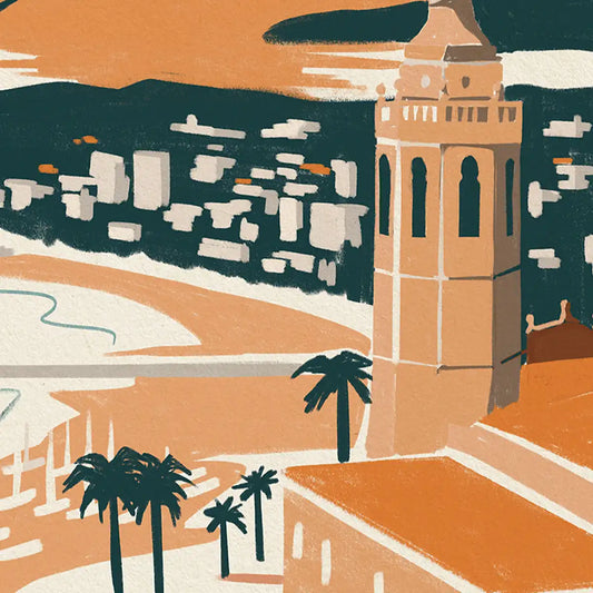
Sitges Bay Poster


Plaça Reial Barcelona Poster


